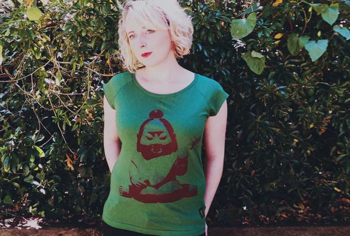
We’ve got one of uchi clothing’s most recent best selling joints OVER HERE, now in these fresh new women’s charcoal bamboo T shirts.
Whether you’re a type geek or a chemistry geek, you can’t fail to be impressed by this execution of a classic design element.
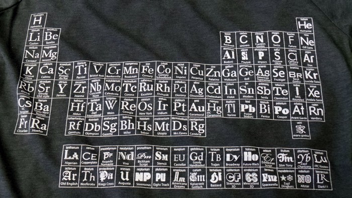
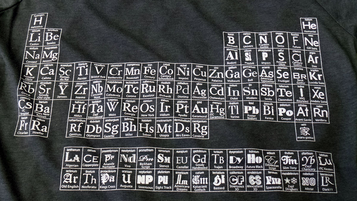
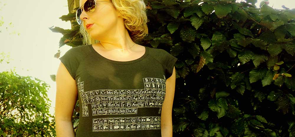
Here’s the first colour drop of uchi’s Typographic Periodic Table – charcoal grey on a women’s bamboo T shirt. Shop them at the OVER HERE store, OVER HERE online and from uchi clothing co.
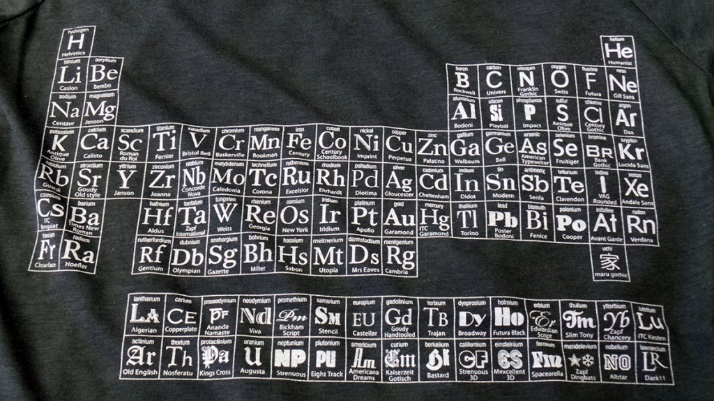
uchi’s Typographic Periodic Table of Elements
uchi’s Typographic Periodic Table — a brief description of each typeface group.
There are many classification systems of type – defined by their visual characteristics (stroke contrast, serif shape, etc) and their historical development or historical reference. Here, I’ve tried to match the main categories with the element groups. Also, except for the Lanthanoids and Actinoids (Glyphic, Script, Blackletter and Graphic faces) and, where possible, in each group I’ve tried to order the typefaces date order from top to bottom. There are some notable exceptions for aesthetic reasons. For example, Helevtica, of course had to be Hydrogen.
Alkali metals
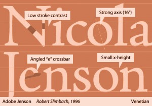
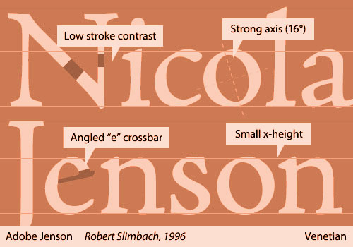
Venetian typefaces (also known as Humanist) 1400s – 1500s:
Characteristics: Bracketed serifs which are angled on lower case letters and ascenders, curve axis slopes to the left, little contrast between thick and thin strokes.
Alkaline earth metals
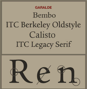
Garalde typefaces (also known as Old Style and Old Face) 1600s:
Characteristics: Bracketed serifs, curve axis slopes to the left, heavier contrast between thick and thin strokes. The lower case e has a horizontal bar.
Other non metals
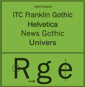
Grotesque/neo grotesque typefaces (San serifs) 1700s – 1800s:
Characteristics: No serifs. Slightly squared curves. Grotesque faces have more contrast between thin and thick strokes than the latter more uniform neo grotesque fonts (Helvetica).
Transition metals
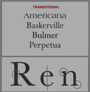
Transitional (also called Neoclassical or Rationalist) 1700s:
Characteristics: Bracketed serifs which are angled on ascenders and lower case letters, vertical or left inclined axis on curves. Influenced by copperplate engraving. Transitional typefaces incorporate characteristics of the earlier Garalde and the latter Didone type.
Metaloids
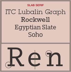
Slab-serif (or Egyptian) 1700 – 1800s:
Characteristics: Typefaces with heavy, square-ended serifs, often the same thickness as the main stem of the letters. Serifs can be with or without brackets.
Post transition metals
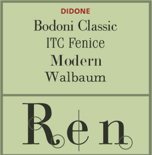
Didone (also called Modern) 1700s:
Characteristics: Didone faces feature strong and abrupt contrast between thick and thin strokes. Curve axis are vertical and the lower case serifs of ascenders are generally horizontal. Generally there are no bracketing of serifs.
Halogens
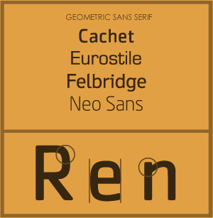
Geomteric sans serif 1700 – 1800s:
Characteristics: Geometric fonts are of uniform weight and based on simple geometric shapes, rectangles and circles. Most Geometric fonts have a single story a.
Nobel Gases
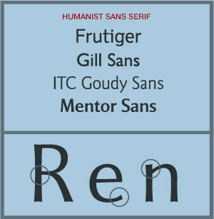
Humanist sans-serif 1700 – 1800s:
Characteristics: Humanist typefaces are sans-serif faces that follow the proportions of traditional Roman inscribed capital letters and the Garalde (or Old Style) lower case letters. Unlike the monoline geometric fonts they have some contrast between stroke lines and most have a two story a and g.
Lanthanoids
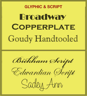
Glyphic:
Characteristics: Typefaces which appear chiselled rather than derived from a calligraphic form.
Script:
Characteristics: Typefaces which imitate cursive handwriting.
Actinoids
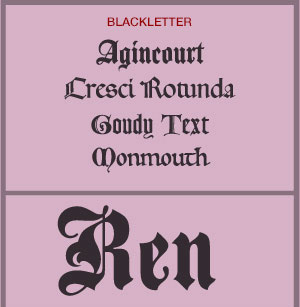
Blackletter (Gothic, Fraktur or Old English) c1100 – 1500s:
Characteristics: Typefaces based on early manuscript lettering. Blacketter typefaces have dramatic thin and thick strokes, and elaborate swirls on the serifs. Used in the printing of the Gutenberg Bible in 1450.
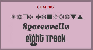
Graphic:
Characteristics: Symbols and typefaces which appear drawn rather than derived from a nibbed pen.